


A Contact Us page in and of itself is not enough to get you leads. Seriously.
Your Contact Us page is a very important, yet often overlooked, part of your website. It’s just a form and your phone number, right? And your prospect has already done half the work just by going to your contact page, right?
Of course, it’s more complicated than that. Ultimately, your goal is to convert those prospects into high-quality customers.
When your prospects arrive, it’s important to provide them with the contact method that they feel most comfortable with. At the same time, you need to make it easy for prospects to provide your business with the right set of information to keep the sales process moving.
With 5 easy changes to your contact page, you can quickly increase the conversion rate on your Contact Us page.
It’s too easy to just slap a form on your page and call it a “Contact Us Page.” But there’s so much more to providing your prospects the right information to convert than that.
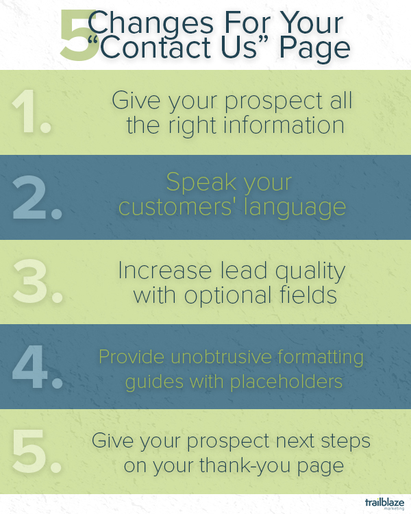
1. Give Your Prospect All the Right Information
One of the most common mistakes with Contact Us pages is that there’s only one way to contact the company. Site visitors often use Contact Us pages as a quick way to validate that the website they’re on is “real” by looking for phone numbers, physical addresses, emails, business hours, and social media links.
In addition to validating that your company isn’t a fly-by-night scam, the more contact information you list, the more ways you give the visitor to reach out to you. As a bonus, this information is crawled by search engines to inform their local listings.
For example, if your website’s main purpose is to get your web visitors to go to your physical store, it may be a good idea to include a map of your location with the added ability to get directions. This makes it easy for visitors to see exactly where you are.
On the other hand, if your business website is mostly web-based or if your only sell in retail stores, the map would be unnecessary.
2. Speak Your Customers' Language
Check out this Contact page from the website Conversion Sciences.
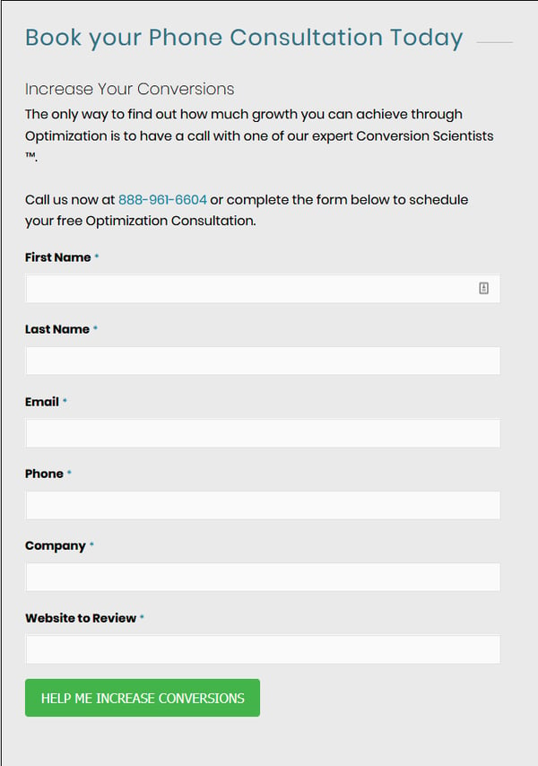
Notice anything about the language it uses? The way the form headline is worded puts the visitor first. The visitor doesn’t “contact” this business, instead, they are urged to specifically “Book Your Phone Consultation Today.”
The above-the-form copy highlights exactly what the prospect should expect out of the relationship: “Increase Your Conversions.”
And see how they speak the customer’s language by providing the right information to “Call us now” to start the sales process.
Finally, the submit button doesn’t just say “Submit.” It instead provides the answer to the question “What happens when I click this button?” The prospect will get help to “increase conversions.”
These copy changes will prime your prospect to know exactly what filling out a contact form will do for them.
3. Increase Lead Quality with Optional Fields
It’s obvious that conversion rate optimization is all about increasing lead volume. If you’re looking to increase form submissions, it’s tempting to remove almost all the fields. After all, conversions can increase by 50% by reducing the number of form fields from four to three.
But in many cases, you also need to increase lead quality from your forms. What’s the use of a pile of unrelated leads that require multiple follow-ups from your sales team?
To avoid this, you may want to add optional, non-required fields to your Contact Form. These give the visitor a chance to describe what they’re looking for, and they can give you the opportunity to learn more about your lead.
Using optional fields doesn’t force the visitor to disclose information. But if they do, you have the advantage of deciding whether their needs are a good match for what you offer.
4. Unobtrusively Prime Users with Placeholder Text
Especially when you’re using optional fields that site visitors and prospects might not be sure how to answer, your fields should include placeholder text. Placeholders, which show in the input area for open-ended form fields that take text, are different than the label. For example, if you take international clients, you might have a field for phone numbers with the label “Phone Number:” and placeholder text that reads “+1 (555) 555-5555.”
By using placeholder text, your users will be primed to submit information in the format that your team can best use. This increases your lead quality by providing more leads in the right format while highlighting prospects who might need more help than you typically give.
5. Provide Next Steps in Your Thank-You Page
After your visitor fills out and submits a form on your Contact Us page, you will want to direct them to a Thank You page. Most importantly, a dedicated Thank You page gives the user an obvious confirmation that the form went through successfully by providing a whole new page instead of an easy-to-miss inline thank-you message. But just like the Contact Us page itself, the simplicity of the page’s purpose leads to its value being underestimated.
The Thank You page provides an opportunity to move a prospect further along the buyer’s journey, even before your company reaches out to them. Thank You pages provide additional content, include links to social media, and even offer the visitor another call-to-action to complete.
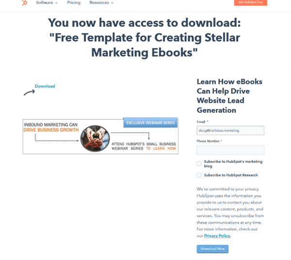
A perfect example of a good Thank You page is this one by HubSpot. Notice how they link to other relevant content and include an additional form that pushes leads further. They immediately provide the download the user was requesting, and they link to other sections of their website as well as their social sharing options.
Increasing Your Conversion Rate with Your Contact Us Page
Your Contact Us page might be the most under-optimized page on your site. But by focusing on what your potential prospect’s experience, you can increase your conversion rates both on the page and inside your sales process.
When you next look at your Contact Us page, ask yourself these 5 questions:
- Are you providing all of your contact information on your Contact Us page?
- Is the microcopy you use focused on the benefits to your potential prospect?
- Are you providing prospects with ways to give you the information your team needs?
- Does your form design guide your prospect to provide the best answers for your team?
- Are you giving next steps on your Thank-You page after your form submits?
If you can’t answer “Yes!” to all five questions, don’t guess how many leads you lost because of your Contact Us page. Schedule a meeting with our Team Leader, Chris Parisi, to find out how Trailblaze can increase your conversion rates on your website today.


